Analysing Crypto Index Products Relative to BTC and ETH

I recently read this article, looking at Sortino and Sharpe ratios for the DeFi funds from Index Coop, PieDAO, PowerPool and Synthetix. While I’m a big fan of using TradFi performance measurement metrics in crypto, especially in portfolio construction, there are some gaps in this analysis.
First, comparing ratios across funds over different time periods doesn’t make much sense. For example, sDEFI launched in June. Of course its performance metrics will be great, given that it fully captured the summer DeFi boom. At the same time, DPI launched in the middle of September, arguably the worst time to launch a DeFi index product. Comparing Sortino and Sharpe ratios for these two products using their respective inception dates is, potentially, misleading.
Second, I understand the desire to include PowerPool’s Power Index (PIPT) in the analysis. However, it launched on December 1st. The sample size is just too small. If the author excluded PIPT, he could’ve analysed two months of data for the remaining products over the same timeframe.
Third, I think there’s a missing point here. Very few investors, if any, will have all of their crypto exposure in DeFi tokens. Instead, most will hold DeFi to complement their exposure to BTC, ETH or both. As such, it’s important to look at the relationship of the different index products to BTC and ETH.
That said, I really like the idea of using risk and performance metrics of individual tokens for portfolio construction. They have long performance track records that we can analyse.
Without further ado, I would like to fill in some of the gaps identified above. This is meant to extend the analysis undertaken by the author and add some additional colour.
I don’t focus on Sortino and Sharpe ratios. Given the short time frame, I prefer to look at the relationship between the DeFi index products and the majors. I excluded PIPT as well as DEFI++ from this analysis, given their short performance histories. This leaves us with four products: DPI, sDEFI, DEFI+L and DEFI+S.
The time period for this analysis is October 22nd to December 23rd for all products, and I will keep updating it going forward. I ran into some issues with the sDEFI data. Coingecko is missing all historical information between October 7th and October 21st. I wanted to use CoinMarketCap numbers instead, but they didn’t align with the Coingecko data at all. Here’s an example. As such, I decided to start the analysis from October 22nd and use Coingecko prices for BTC, ETH and all index products.

Perhaps, it is a sign that crypto is not ready for serious analysis — we can’t even agree on a closing price for a security. But I digress.
First, I wanted to look at the correlations. Correlation simply measures the strength of the relationship between two securities. It can range between -1 and +1. Correlation of +1 means that every time security A goes up, security B goes up with it. Keep in mind that correlation gives us a sense of direction, but tells us nothing about the magnitude.
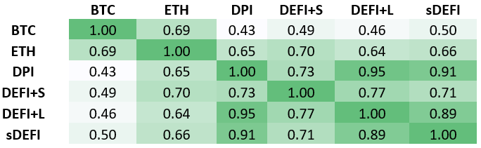
Few notable things here. All four products are somewhat correlated with BTC, with correlations between 0.43 and 0.50. Their correlation with ETH is more meaningful, between 0.64 and 0.70. Looking at the relationships between the four DEFI index products, we can see that most correlations are above 0.7, suggesting a strong relationship. For example, DPI and DEFI+L and DPI and sDEFI have a correlation of 0.95 and 0.91, respectively. This tells us that they moved virtually in lockstep over the period between October 22nd to December 23rd. Correlation between DEFI+L and sDEFI is also strong at 0.89.
As we mentioned before, correlation only gives us the directional idea of how these products move. To get the sense of the magnitude, we need to look at beta. Beta measures the magnitude of the relationship between two products. If Security A has a beta of 1 to security B, it means that each time security B goes up by 1%, security A will go up by 1% as well.
Note to reader: This chart is meant to be consumed horizontally, not vertically. The beta of BTC to ETH will not equal the beta of ETH to BTC.

Several observations here. All index products have higher beta in relation to each other than the majors. To some degree, this speaks to the fact that their performance is driven more by idiosyncratic factors than the market overall. Once again, we can see the very close relationship between DPI, DEFI+L and sDEFI over the period.
Another interesting metric that we can use is upside and downside capture against BTC and ETH. Upside capture indicates, on average, how much on Bitcoin’s upside does a token capture, same story on the downside.
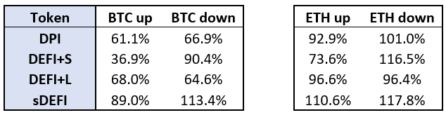
Ideally, we want upside capture to exceed downside capture resulting in a positive net number. That’s what we would be looking for from an asset manager, for example. In relation to BTC, only DEFI+L satisfies that criteria, while DPI is reasonably close to neutral net capture. sDEFI is not doing too well on this metric, and DEFI+S is worse still. When it comes to ETH, we see a wider range of outcomes. Upside capture ratios are anywhere between 73.6% for DEFI+S and 110.6% for sDEFI. Downside captures for ETH are above 100% for the most part, meaning that these DEFI index products usually move by more than ETH on the downside. The only exception here is DEFI+L. Overall, only DEFI+L has neutral net capture for ETH, while DPI and sDEFI are single-digit negative, and DEFI+S lags behind.
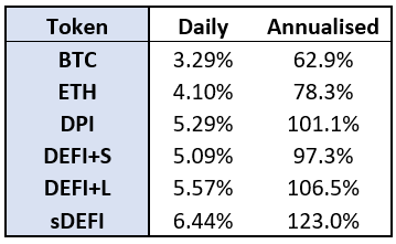
I saved standard deviation for last. Standard deviation is the primary measurement used for volatility. It measures how widely returns are dispersed from their average. If our returns follow the normal distribution pattern, also known as the Bell Curve, we can expect that 68.2% of the time, daily return will be +1 or -1 standard deviation from its mean. We can see that DEFI+S is the least volatile index product, by a small margin, while sDEFI exhibits significant volatility, nearly double the volatility of BTC.
We can also consider what happens to the volatility if these DEFI index products are held together with either BTC or ETH. In this particular case, diversification doesn’t add much value in terms of both risk and return, even though the DeFi Pulse Index (DPI)correlation between BTC and various index products is moderate. Here’s the reason why. Usually, we tend to see higher risk products delivering higher returns. In our case, however, BTC has the lowest risk and highest return, while index products have the highest risk and lowest return. Obviously, the period of observation is limited. Alternatively, Bitcoin just might be the best game in town at this point.
Here are the numbers. 50/50 BTC and 80/20 BTC represent a portfolio with 50% allocation and 80% allocation to BTC, respectively. Same with ETH. 40/40/20 is a 40% BTC, 40% ETH and 20% index fund portfolio. I used daily standard deviation and cumulative returns over the period between October 22nd to December 23rd.
DeFi Pulse Index (DPI)

DEFI+S

DEFI+L

sDEFI

Not ready for prime time
As I mentioned above, this is a helpful start in applying traditional financial performance metrics to portfolio construction and analytics of risk and return of DEFI index funds. However, the performance histories are still far too short to be statistically meaningful. I would encourage everyone to take this data with a grain of salt, more like a curious nugget of information than definitive analysis. Like everything else in crypto, this is just the beginning.